
Please vote for your favourite picture - one vote per person. The poll will run for three days 
Also, please feel free discuss any of the pictures in this thread, but please keep entries anonymous until the voting has ended!
This month's topic 'Primary Colours' was chosen by Curiosity
Please don't forget to enter this fortnight's challenge on the subject of degeneration and dilapidation.
OK, here are this month's entries:
PHOTO ONE:

___________________________________
PHOTO TWO:

___________________________________
PHOTO THREE:

"Uh... blue and yellow"
___________________________________
PHOTO FOUR:

___________________________________
PHOTO FIVE:

___________________________________
PHOTO SIX:

"Some red. yesterday".
___________________________________
PHOTO SEVEN:

___________________________________
PHOTO EIGHT:

"Last cigarette"
___________________________________
PHOTO NINE:

___________________________________
PHOTO TEN:

___________________________________
PHOTO ELEVEN:

___________________________________
PHOTO TWELVE:

___________________________________
PHOTO THIRTEEN:

___________________________________
PHOTO FOURTEEN:

Also, please feel free discuss any of the pictures in this thread, but please keep entries anonymous until the voting has ended!
This month's topic 'Primary Colours' was chosen by Curiosity
Please don't forget to enter this fortnight's challenge on the subject of degeneration and dilapidation.
OK, here are this month's entries:
PHOTO ONE:
___________________________________
PHOTO TWO:
___________________________________
PHOTO THREE:
"Uh... blue and yellow"
___________________________________
PHOTO FOUR:
___________________________________
PHOTO FIVE:
___________________________________
PHOTO SIX:
"Some red. yesterday".
___________________________________
PHOTO SEVEN:
___________________________________
PHOTO EIGHT:
"Last cigarette"
___________________________________
PHOTO NINE:
___________________________________
PHOTO TEN:
___________________________________
PHOTO ELEVEN:
___________________________________
PHOTO TWELVE:
___________________________________
PHOTO THIRTEEN:
___________________________________
PHOTO FOURTEEN:

I think you missed a late entry Mimi -- http://gallery.eggwan.com/v/beteo/conte ... n.jpg.html
Ooh, someone snuck that in with seconds.... I have added it to the voting.
OK, all in now. It's five passed midnight so deadline has passed.
OK, all in now. It's five passed midnight so deadline has passed.

Some strong entries here. Going to keep my head scratching for a while. You're all just so damned ace. 
I've renamed each of the photos in the gallery to correspond to the (randomly chosen) numbers Mimi has used above, and reordered the album into order. If you find the pictures above hard to compare when you are scrolling up and down you may find it easier to browse the thumbnails on
http://gallery.eggwan.com/v/beteo/contest4/
Also, there was another last second entry
http://gallery.eggwan.com/v/beteo/conte ... s.jpg.html
which is a great shot but I think came in too late
http://gallery.eggwan.com/v/beteo/contest4/
Also, there was another last second entry
http://gallery.eggwan.com/v/beteo/conte ... s.jpg.html
which is a great shot but I think came in too late
I love picture nine. The colours are so deep, and I love the shallow focussing.
Let the "Green is primary colour" debate begin!
I voted nine, it's a fantastically composed shot.
Green is definitely a primary colour, in some aspects. In lighting it is a primary colour. I guess the traditional red/yellow/blue spring automatically to mind, but for me the primary colours are cyan/magenta/yellow as they are the colours that I use in my work.
I can mix you any colour of any shade using those three colours and black & white, so I think of those as the three primary colours, but I think that red,yellow and blue, and then green in the context I spoke about are all primary colours for different tasks.
I can mix you any colour of any shade using those three colours and black & white, so I think of those as the three primary colours, but I think that red,yellow and blue, and then green in the context I spoke about are all primary colours for different tasks.
Dudley wrote:
Let the "Green is primary colour" debate begin!
The additive primary colours are red, blue, and green (used in displays). The subtractive primary colours, which I've also heard called secondary colours by arty types, are cyan, magenta, and yellow (used in inks). Both of these can be used to mix nearly all colours, until you reach the hilarity that is out-of-gamut errors (I note Mimi has spared us that).I hope I have that right!
Interesting the split between pictures with all the primary colours and those that focus on one. Ambiguous themes are a great idea for these competitions.
I was just emailing someone explaining the difference between display and printing gamut...
Ah, Stevie Wonder just came blaring out of the TV, that's calming. Phew....
The secondaries, to me In relation to my cyan, magenta and yellow), are orange, purple and green. I think you get the 'truest' versions of these by mixing equal quantities of what I think of as artists primaries.
Red, blue and yellow I think of as primary colours for primary school - they are basic colours, but I think they are the most popular idea of primary colours.
All this said there are some photos here that I REALLY like, though my immediate favourite has a single element that is really detracting from the overall shot for me, and I am finding it hard not to keep noticing it.
i will have a look tomorrow with less tired eyes.

I've voted for the dice, just because [glee]multisided dice!!![/glee]
i may have a better explanation if I can actually get any sleep, bah.
i may have a better explanation if I can actually get any sleep, bah.
Can any passing mods please unpin the current stickied photography thread and pin the new two, please?
I like the dice - I like the narrow depth of field. I think it is slightly too crowded and too dark to make the shapes desceranble which detracts from the impact for me, but I think it is a good shot and one of my favourite shots, though I do not think that it really encompasses the Primary Colours theme quite as much as some other pictures, being mostly very dark colours and the highlight colours being more secondary colours. The orange 'pops' the most, to me.
Mimi wrote:
Can any passing mods please unpin the current stickied photography thread and pin the new two, please?
Absolutely.
Mimi wrote:
I like the dice - I like the narrow depth of field. I think it is slightly too crowded and too dark to make the shapes desceranble which detracts from the impact for me, but I think it is a good shot and one of my favourite shots, though I do not think that it really encompasses the Primary Colours theme quite as much as some other pictures, being mostly very dark colours and the highlight colours being more secondary colours. The orange 'pops' the most, to me.
That makes sense. i'm absolutely terrible at critiquing anything visual - my mind just doesn't work that way. A friend was trying to get me to have an opinion on her photography beyond like/dislike the other day, and I was struggling.
I'm also rambling pointlessly.
I like ____________
Is often the best way to decide what you like most.
Gut feeling is the best guide. Don't choose art for your wall according to scientific principles of composition and the 'magic spiral', go with what makes you go 'Wow! great!'
Is often the best way to decide what you like most.
Gut feeling is the best guide. Don't choose art for your wall according to scientific principles of composition and the 'magic spiral', go with what makes you go 'Wow! great!'
D8s D10s and D20s, oh my! Oh and D6s, but they're boring. Lots and lots of D10s there. Must be a White Wolf: The Splattening player.
Mimi wrote:
Red, blue and yellow I think of as primary colours for primary school - they are basic colours, but I think they are the most popular idea of primary colours.
Interesting how different the perspectives can be -- "primary colours" to me immediately RGB as almost all the colour work in my life has been orientated around computer graphics. Once in a rare while I need to print something, so I am aware of CMYK and gamuts and whatnot, but I don't have to really think about it ever. 
Pundabaya wrote:
D8s D10s and D20s, oh my! Oh and D6s, but they're boring. Lots and lots of D10s there. Must be a White Wolf: The Splattening player.
I am so daft I almost lashed out 30 quid of a set of granite runic dice the other day. He had steel and obsidian ones too
I don't even play those games anymore! Pundabaya wrote:
D8s D10s and D20s, oh my! Oh and D6s, but they're boring. Lots and lots of D10s there. Must be a White Wolf: The Splattening player.
Ars Magica had lots of d10s IIRC.
OK - I think I am immediately grabbed by picture nine, but my eyes keep going to that dark square in the upper right corner, It is really bugging me. i think it would have been my favourite photo of the competition of the whole set up had ben moved slightly to the left, a slightly higher shot having been taken, or the photographer moved over to the right so as to avoid the pocket, especially to avoid it in that position... As it is it draws my eye from the subject. I think the set-up (apart from that one dark patch (and being bang in the corner draws my eye further) is wonderful. I like the area of focus - your eye is on that cue tip, and also the way the theme has been used in the creation of the scene.
I will have another look tomorrow to decide on my vote, as that dark corner is pulling my eye so much that I don't know whether to look not the first photo to grab my eye, but one that keeps my eye longer. What I'd like on display, I guess.
I will have another look tomorrow to decide on my vote, as that dark corner is pulling my eye so much that I don't know whether to look not the first photo to grab my eye, but one that keeps my eye longer. What I'd like on display, I guess.

Red, Yellow and Blue are the only primary colours, because they cannot be made by mixing other colours. Green, orange and purple are secondary, because they're made by mixing two of the primaries.
Not that I ruled any of the pictures out based on that - it's a friendly competition, this.
Not that I ruled any of the pictures out based on that - it's a friendly competition, this.
Aaraghhhh.... I am being squished by the nerdiness... 
Hehe, only kidding, but I must be off to bed. Have a good night, chaps x
Hehe, only kidding, but I must be off to bed. Have a good night, chaps x
sinister agent wrote:
Red, Yellow and Blue are the only primary colours, because they cannot be made by mixing other colours. Green, orange and purple are secondary, because they're made by mixing two of the primaries.
This is only true for additive, not subtractive, colours. It works on TVs but not printer inks. Edumacation. sinister agent wrote:
Red, Yellow and Blue are the only primary colours, because they cannot be made by mixing other colours. Green, orange and purple are secondary, because they're made by mixing two of the primaries.
Not that I ruled any of the pictures out based on that - it's a friendly competition, this.
Not that I ruled any of the pictures out based on that - it's a friendly competition, this.
Depends if you're talking pigment or light.
Edit- as Ricardo CheeryCopse said.
When I did art at school (up to the age of 13, then I was chucked out, the gits) the only paint colours we ever had were the Cyan, magenta, yellow, black and white. When mixing pigments they really do offer you the fullest spectrum of colours I luurve them.
I was going to take pictures of Kato in these colours, but didn't think many people would know what it was. Plus, it's just in blocks (Kato is a type of polymer clay)
I luurve them.I was going to take pictures of Kato in these colours, but didn't think many people would know what it was. Plus, it's just in blocks (Kato is a type of polymer clay)
richardgaywood wrote:
sinister agent wrote:
Red, Yellow and Blue are the only primary colours, because they cannot be made by mixing other colours. Green, orange and purple are secondary, because they're made by mixing two of the primaries.
This is only true for additive, not subtractive, colours. It works on TVs but not printer inks. Edumacation.No! NOO! I RESIST YOUR KNOWLEDGE.

I would have voted for number one, because I love the shape and how it fits in the frame. Unfortunately the busy background and random passing car in the corner were just too distracting. A wider aperture might have helped with the busy background, maybe timing for the car.
Number five is a really nice macro shot, but xbox controller was the first thing I thought of when I saw primary colors being the subject on a gaming biased forum
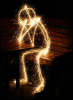
My vote in the end, went to number six. It's not sharp, I'm not sure it's even in focus, but that seems to give the whole thing almost a wood carving look that, for me, suits both the primitive lighting (torch flames) and the strength of the color itself. I will try to add comments on the rest later.
Number five is a really nice macro shot, but xbox controller was the first thing I thought of when I saw primary colors being the subject on a gaming biased forum
My vote in the end, went to number six. It's not sharp, I'm not sure it's even in focus, but that seems to give the whole thing almost a wood carving look that, for me, suits both the primitive lighting (torch flames) and the strength of the color itself. I will try to add comments on the rest later.

My favourite photo is number 6. I like the atmosphere. Photo 9 is brilliantly done though and extremely professional looking. But which should I vote for? 9 is probably the better photo but I enjoy 6 more. CAN'T DECIDE.

Nirejhenge wrote:
My favourite photo is number 6. I like the atmosphere. Photo 9 is brilliantly done though and extremely professional looking. But which should I vote for? 9 is probably the better photo but I enjoy 6 more. CAN'T DECIDE.
Vote for the one you enjoy!
Mimi wrote:
OK - I think I am immediately grabbed by picture nine, but my eyes keep going to that dark square in the upper right corner, It is really bugging me.
I actually hadn't noticed that at all, it's the pocket it's supposed to be there.
That said I can see how it may have been better if possible to rotate left to get a clear background. Interesting.
Then again, hadn't noticed the car in pic 1 either. I assume that was left (or put in deliberately) because it was red.
I really like no. 7, and am interested in finding out what exactly it is. It's very soothing.
I want to eat no. 11.
I want to eat no. 11.
Oh, yes, I know it was the table pocket, I just wasn't sure if I liked it there last night. Well, no, I didn't like it there, but what I mean is I thought that was just tired and after a good night's sleep it might just stop irking me that little bit, but it's still the immediate place my eye travels to and it's tonally so much darker than the rest of the picture that it's a shame the photographer did not think to set up or turn that last little bit, or take a few from different angles and compare them when (s)he got home - then I think it would have been apparent ad I think the alternatives, if sharp, would have been preferable.
With all that said I like photo eight, because, really, it is so stupid (in a nice, silly sense) and looks so ad-hoc, but the strong visual colours really jostles with the bit of rough paper with a biro-drawn stick man on it. It is not the most professional, but it is one of the most colourful, and it makes me smile every time I look at it.
I think if the parakeet had been taken against another, not so densely coloured tree or sky backdrop it would have been a winner for me, but pain in the bum that nature is, it never works out that way.
Oh, I also like both thirteen and fourteen. Thirteen is just a little to out of focus, unfortunately, but I would like to own all of those multi-coloured things, please. Fourteen is quite joyful for the single poppy in amongst the blue and yellow field of flowers, quite lovely.
If people could try and get their pictures in at least an hour before the deadline it would be really helpful, because when I am putting things together at midnight I am sometimes feel a little tired and if I rush things then am prone to making mistakes.
The deadline is midnight, so pictures before then will still be accepted right up to that point, but if it is possible to submit just that little bit earlier then it makes things easy for me. If not, I understand, it is fine.

Some really ace photos this time around, but I went through twice and each time number nine leapt out at me, so I voted for that one. If that one wasn't in the competition there were four or five more I could easily have voted for, too.
Here's what passes through my mind.
Photo One - I really like the way the red pops out. The lines are interesting, and curve nicely. The background does make it seem a little 'busy', but it's still good.
Photo Two - Some really nice shades of green, and I like the way the tree trunks going upwards convey an impression of straight lines without actually being straight. A nice nature shot, but it's probably a little too dark for my personal tastes.
Photo Three - What a wonderful image! I like how the colours are slightly muted. It's bright, but there's an absence of light that works here. Despite the season, the balance of the dark leaves gives it an almost autumnal feel. Doesn't really fit the theme so well (other than the beak), but I do really like the photo.
Photo Four - That's a cute little pencil holder! Sadly, it's a bit out of focus, and doesn't really work for me so much.
Photo Five - Really nice macro shot. A good idea, and I like the contrast between the colours, the cream/white controller and the black background. My only potential peeve with an excellent shot is that it would perhaps be cool to have the focus more towards the back of the buttons, on the yellow (primary) button as opposed to the green. Or possibly pull the analogue stick back to remove it appearing as somewhat of a blob. Either way, it's a great photo.
Photo Six - I agree with the person who said it's reminiscent of a wood carving of some form. Bold red colours give it a good atmosphere.
Photo Seven - I really love this, but have no bloody clue what it is! Fantastic abstract!
Photo Eight - Excellent 'pop' from the red to the bold blue. I'm not certain about the little stick figure, but it does have a certain quirky charm.
Photo Nine - I love the composition of this. All of the balls have excellent colour (though the blue does blend in slightly with the table). I love that the cue is in there, and the white ball too. I actually like the pocket being in the corner too... added with the cue/white, it gives it a feeling of action, despite it being static.
Photo Ten - D6, D8, D12, D20... no D4? A fun picture. Not too evident in terms of primary colours, per se, and perhaps a little dark for some of the colour to stand out, but that does accentuate the lighter ones. I like it.
Photo Eleven - Haha! Did you actually sort those yourself? Are you a roadie for a famous rock band? It's visually striking, especially the yellow, and having the mixed bowl in there works really well. Perhaps for teh theme, given that the yellow is the only strictly primary colour, you could have had the brilliant yellow bowl on its own next to the mixed bowl? As in primary vs non-primary? Just an idea... I like this one too.
Photo Twelve - A smart idea, and the colour segregation works, but it seems a little out of focus. I would have preferred it to be in focus.
Photo Thirteen - I half love this. The colours are wonderful. The blue and yellow especially, but the use of primary colours works well. Also, the items used are fantastic. A really interesting composition... however, the red colours is totally 'blown out' on the rose, and we lose the details of it. Also, I have no idea what the scientific looking thingy in the backgroundis, but it distracts from the items focused on.
Photo Fourteen - I really like this take on the theme, and having the three different colours of flower together is a great idea and a good shot. I think perhaps getting closer in might have made it more dramatic, but as it stands it's a nice shot.
Overall
I'd say that it's between 5, 7, 8 and 9 for me... but I plumped for 9 in the end, for the overall composition.
Photo One - I really like the way the red pops out. The lines are interesting, and curve nicely. The background does make it seem a little 'busy', but it's still good.
Photo Two - Some really nice shades of green, and I like the way the tree trunks going upwards convey an impression of straight lines without actually being straight. A nice nature shot, but it's probably a little too dark for my personal tastes.
Photo Three - What a wonderful image! I like how the colours are slightly muted. It's bright, but there's an absence of light that works here. Despite the season, the balance of the dark leaves gives it an almost autumnal feel. Doesn't really fit the theme so well (other than the beak), but I do really like the photo.
Photo Four - That's a cute little pencil holder! Sadly, it's a bit out of focus, and doesn't really work for me so much.
Photo Five - Really nice macro shot. A good idea, and I like the contrast between the colours, the cream/white controller and the black background. My only potential peeve with an excellent shot is that it would perhaps be cool to have the focus more towards the back of the buttons, on the yellow (primary) button as opposed to the green. Or possibly pull the analogue stick back to remove it appearing as somewhat of a blob. Either way, it's a great photo.
Photo Six - I agree with the person who said it's reminiscent of a wood carving of some form. Bold red colours give it a good atmosphere.
Photo Seven - I really love this, but have no bloody clue what it is! Fantastic abstract!
Photo Eight - Excellent 'pop' from the red to the bold blue. I'm not certain about the little stick figure, but it does have a certain quirky charm.
Photo Nine - I love the composition of this. All of the balls have excellent colour (though the blue does blend in slightly with the table). I love that the cue is in there, and the white ball too. I actually like the pocket being in the corner too... added with the cue/white, it gives it a feeling of action, despite it being static.
Photo Ten - D6, D8, D12, D20... no D4? A fun picture. Not too evident in terms of primary colours, per se, and perhaps a little dark for some of the colour to stand out, but that does accentuate the lighter ones. I like it.
Photo Eleven - Haha! Did you actually sort those yourself? Are you a roadie for a famous rock band?
It's visually striking, especially the yellow, and having the mixed bowl in there works really well. Perhaps for teh theme, given that the yellow is the only strictly primary colour, you could have had the brilliant yellow bowl on its own next to the mixed bowl? As in primary vs non-primary? Just an idea... I like this one too.Photo Twelve - A smart idea, and the colour segregation works, but it seems a little out of focus. I would have preferred it to be in focus.
Photo Thirteen - I half love this. The colours are wonderful. The blue and yellow especially, but the use of primary colours works well. Also, the items used are fantastic. A really interesting composition... however, the red colours is totally 'blown out' on the rose, and we lose the details of it. Also, I have no idea what the scientific looking thingy in the backgroundis, but it distracts from the items focused on.
Photo Fourteen - I really like this take on the theme, and having the three different colours of flower together is a great idea and a good shot. I think perhaps getting closer in might have made it more dramatic, but as it stands it's a nice shot.
Overall
I'd say that it's between 5, 7, 8 and 9 for me... but I plumped for 9 in the end, for the overall composition.

I love photo 9 - I think it's the best example of "primary colours" in the selection too. Photo 5 was my second choice, but 9 just about edged it for me.
I realized if I commented on every photo but mine, that would kind of give it away... I quite like number 9's pocket in shot- there's a clear line from the cue, the balls, to the pocket- the eye is led from one the other along the path of the shot. Number eight- I *love* the red and blue, but augh! why not a yellow post-it note?!
Why does everyone keep saying the primary colours are red, blue, and yellow?

theres 3 different types of primary colours im sure.
the usual light perception of red yellow and green
and then the tv ones
and also the printer ink ones.
the usual light perception of red yellow and green
and then the tv ones
and also the printer ink ones.
richardgaywood wrote:
Why does everyone keep saying the primary colours are red, blue, and yellow?
I like mixing my gamuts almost as much as my metaphors.
Ahwell Ive made one up. Although yellow is in one of them.
Green post-it notes are thin on the ground. RGB, CMY are all primary colors.
richardgaywood wrote:
Why does everyone keep saying the primary colours are red, blue, and yellow?
RBY is a perfectly valid set of primary colours. Especially for opaque pigments. I honestly can't see how you'd mix fire engine red out of CYM if you're using oil paints.
Magenta and yellow give a strong red
So does red and red and more red.
Also red.
Also red.
if the question is how do you mix red from only cyan, magenta and yellow, the answer is not 'by using lots of red'.
Mimi wrote:
if the question is how do you mix red from only cyan, magenta and yellow, the answer is not 'by using lots of red'.
It may not have been meant to be, but that is the funniest thing I've read fo ages


Page 1 of 3 [ 147 posts ]