Be Excellent To Each Other

And, you know, party on. Dude.

All times are UTC [ DST ]


Reply to topic  [ 13 posts ] 
Author Message
 Post subject: Photo Editing Lightroom Fun
PostPosted: Tue Jan 08, 2013 14:15 
User avatar
Excellent Member

Joined: 30th Mar, 2008
Posts: 8019
Location: Cardiff
Lightroom 4, as I never tire of banging on, is fantastic. If I couldn't use it I'd basically go and try film instead and get a darkroom. It's great for those quick corrections that can fix mistakes in the field and of course can let you get really creative with your photographs.

But most importantly in getting to know Lightroom and how it works, you will find yourself painlessly over time getting to know what makes or breaks a photograph. It's less difficult than you'd think, too. Lightroom operates on practically every level by utilising simple sliders. Push to the left towards the minus symbol to darken or decrease effect, push to the right towards the plus symbol to lighten or increase effect. That's it.

Increase sharpness? BAM! To the right. Decrease saturation? Um, Bloooo! To the left.

The nack is knowing how far you can push things. There's nothing more revolting than a drastically oversharpened or over-saturated image, which is why HDR largely sucks.

So I asked MarkG for some shots of his for me to play with. I liked his rolling hill shots very muchly on Flickr, and there was a great minimalism from the misty lake stuff he had on offer. But I figured that they wanted a little Lightroom love, so I decided to play with a couple...

Image

First off was the jetty and yacht. If you look at the RAW file there's a fair few glitches, but Mark's fixed all of these himself and the version on his Flickr channel is a beauty. I love photos with only a couple of elements in. The main change was in my deciding to crop. I figured with the bottom of the frame being a wee bit closer to the jetty, it increased the impact of the near-diagonal leading line and thus increased immersion.

Mark had shifted his photo to B&W from the RAW. In my opinion it was the right thing to do. While a huge print would hold some interest in the little glimpses of colour, in a largely monochrome work these are distracting from the overal composition. I did decide to lighten the moss just a touch by clicking on the clumps and pushing up, causing the luminosity slider to shift to the right. This gave a little more texture to the jetty.

I then decided to just lessen the clarity of the lower half of the jetty. it was so perfectly reflected by the water (great long exposure, Mark!) that it seemed beyond a reflection - so I brushed over it (hit 'o' to see what your brush covers) and decreased the clarity by 40% or so. Not too much though, otherwise all texture is lost.

Mark had been wise in eliminating in a sinister-Stalinist fashion a waterfowl very close to the right side of the frame, but I went a step further and eliminated the one above the tip of the jetty. Why? Because I wanted a truly lonely feeling in this one. An end of world thing. Plus the bird was distractingly small, you notice it and then look closer to figure what it is. Bit distracting.

Lastly I upped the sharpness a little touch, decreased it a tiny bit for the reflection and tweaked the light level up of the band of mist on the water's edge to help it stand out a tiny bit more.

The final touch - a wash of ever-so-slight blue for that chill winter's feel. A mere few percent of blue in the lights, a tiny bit more in the darks. With the crop I also find it now makes a nice Desktop background, ta Mark!


Next up - Speedboat Squad!

Image

Again Mark's right on the money with the monochrome. I especially like the emphasis on the wake, this is about speed - and thus the distance travelled. Placement of the speedboat in the left would have ruined the shot. There's nowt wrong with Mark's shot, so I decided to try something different.

One possible slight distraction is the way the lower portion is darker than the upper. This is obviously real, so it isn't troubling. The mist, as usual, is lighter than the water, so we really know what we're looking at. Trouble is the eye tends to wander up to the light. You could match the water to the mist but that would skew the shot towards fantasy.

So first I figured cropping a little. I kept the same ratio but moved the frame up a little, placing the boat down just a touch so it was on the golden ratio line of the lower third. I then decided to pick up the old graduated filter tool and burn (darken) the water. This gave it a nice 3D effect, but it look imbalanced. I decided to do the same to the 'sky'. Now, this meant the photo was now lying somewhat, as I was now impling a thinner mist above that was letting in a dark sky. With another wash of blue this accentuated the effect. But eh, so what. The tunnel of light it created emphasised the wake of the boat and gave it more zip, so all to the good. Though I do reckon maybe a 16x9 crop might be nice, too.

Hope you enjoyed hearing me boringly ramble on. Again, this wasn't a case of fixing, the shots are good off the bat, but of finding diffent effects. I figured I'd make a new thread of Lightroom experiments. If there's any RAW files you'd like me to play with, or any of mine you'd like some fun tinkering, why not post here along with problems, solutions and ingenious tips?


Also, no need to limit this to Lightroom. Photoshop, GIMP, Aperture - all are valid. Lightroom is bestest though, obv. :hug:

Laters!

Btw, Mark, I've uploaded to my Flickr but made 'em 'Me Only View', so I'm not touting them as my own, tempting as that was! :D

_________________
"Peter you've lost the NEWS!"

Bored? Why not look at some pretty pictures on my photography blog? Here: http://petetakespictures.com

Come & See My Flickery Pics Here: http://www.flickr.com/photos/nervouspete/


Top
 Profile  
 
 Post subject: Re: Photo Editing Lightroom Fun
PostPosted: Tue Jan 08, 2013 14:24 
User avatar

Joined: 30th Mar, 2008
Posts: 16559
Amazing, thanks Pete. Really interesting to see your approach all laid out like that. And I love the results, huge improvement.


Top
 Profile  
 
 Post subject: Re: Photo Editing Lightroom Fun
PostPosted: Tue Jan 08, 2013 16:08 
User avatar
baron of techno

Joined: 30th Mar, 2008
Posts: 24136
Location: fife
Thanks both of you :hug:
Attachment:
Capture.PNG


You do not have the required permissions to view the files attached to this post.


Top
 Profile  
 
 Post subject: Re: Photo Editing Lightroom Fun
PostPosted: Tue Jan 08, 2013 16:26 
User avatar
ugvm'er at heart...

Joined: 4th Mar, 2010
Posts: 22270
Any chance of a original, markiefied and peteiefied side-by-side comparison?


Top
 Profile  
 
 Post subject: Re: Photo Editing Lightroom Fun
PostPosted: Tue Jan 08, 2013 16:35 
8-Bit Champion
User avatar
Two heads are better than one

Joined: 16th Apr, 2008
Posts: 14489
Trooper wrote:
Any chance of a original, markiefied and peteiefied side-by-side comparison?


Pete on top of Mark :hat:

Image
Image


Top
 Profile  
 
 Post subject: Re: Photo Editing Lightroom Fun
PostPosted: Tue Jan 08, 2013 19:54 
User avatar

Joined: 12th Apr, 2008
Posts: 17771
Location: Oxford
Great stuff Pete. Thanks for revealing some of your secrets.


Top
 Profile  
 
 Post subject: Re: Photo Editing Lightroom Fun
PostPosted: Wed Jan 09, 2013 23:11 
User avatar
Can you dig it?

Joined: 5th Apr, 2008
Posts: 4668
This is great! I really like the idea behind this and those two photos are wonderful. I've never really done anything close to proper photo editing, so find this very interesting. It could be a series that runs and runs :)

Would it be possible to also see a copy of the photo exactly as it came out of the camera (completely untouched by either yourself or MarkG, as I assume Mark did a little bit of editing himself).

_________________
rumours about the high quality of the butter reached Yerevan


Top
 Profile  
 
 Post subject: Re: Photo Editing Lightroom Fun
PostPosted: Thu Jan 10, 2013 12:09 
User avatar

Joined: 30th Mar, 2008
Posts: 16559
Here you go:

https://docs.google.com/folder/d/0B9Qs7 ... FQWTA/edit


Top
 Profile  
 
 Post subject: Re: Photo Editing Lightroom Fun
PostPosted: Thu Jan 10, 2013 16:28 
User avatar
Excellent Member

Joined: 30th Mar, 2008
Posts: 8019
Location: Cardiff
Sir Taxalot wrote:
This is great! I really like the idea behind this and those two photos are wonderful. I've never really done anything close to proper photo editing, so find this very interesting. It could be a series that runs and runs :)


I'm happy to do more, just trying to think of a photo that would make a good instance that I haven't already done. ?:|

_________________
"Peter you've lost the NEWS!"

Bored? Why not look at some pretty pictures on my photography blog? Here: http://petetakespictures.com

Come & See My Flickery Pics Here: http://www.flickr.com/photos/nervouspete/


Top
 Profile  
 
 Post subject: Re: Photo Editing Lightroom Fun
PostPosted: Thu Jan 10, 2013 17:05 
User avatar
Excellently Membered

Joined: 30th Mar, 2008
Posts: 1268
Location: Behind you!
Love reading this thanks! :kiss:


Top
 Profile  
 
 Post subject: Re: Photo Editing Lightroom Fun
PostPosted: Thu Jan 10, 2013 21:23 
User avatar
Excellent Member

Joined: 30th Mar, 2008
Posts: 8019
Location: Cardiff
Okay, pretty thorough one here:


First of all, much as when you take a photo, you must also think on how you want to approach your visual style when post-processing. No joke, digital post-processing is half of making a good photo. While you can never polish a turd (trust me, I've tried, if you fail the points of a good photo then nothing is going to save you) it's incredible how much you can add to a photo that initially looks a little lifeless. Ansel Adams said that his photos were made in the darkroom. Who am I to argue?

When I'm looking at a photo, figuring on the style, I've got a folder system running in my brain...

Street Photography:

Colour -

Martin Parr - garish colours, flat lighting.
Majiec Dakowicz - Unfussy, standard digital, little bit of clarity.
Partick Joust - Lucious darks, glowing colours, earthy tones.

Black & White:

Henri Cartier Bresson / Walker Evans: Rough, medium contrast, unsharpened, simple light, documentary.
William Klein: Thick blacks, smeared, grainy, immediate, popping.
David Bruce: High contrast, angry, industrial.

Same with portraits:

Steve McCurry - Rich vibrant colours, amazing eyes, strong clarity, National Geographic.
Dan Winters - Delicate colours and light, porcelain skin, odd streak of powerful colour, refined.
Helmut Netwon - FETISH.

Or landscapes:

Stephen Shore - Colour, eggshell skies, warm light or overcast, low vibrancy, soft edges, very detailed.
Michael Ormerod - Black and white, punchy, hard, black and white, grainy. Fuck you, this is a landscape.
William Eggleston - Colour for its own sake. Father of colour. Deceptively simple. Lomo.
Constable
Lowry
Etc.

With Reenactment/Living History the questions become different, and more about aptness than personal feeling. You service the story rather than make it, it's surprisingly akin to documentary - only skewing to the fantasy of documentary. This is why I don't shoot US Civil War in sepia, or B&W. Sepia was the hallmark of cumbursome box cameras, and so only very formal portraits or unpeopled landscapes can work in this format. If you try it with action, there's an immediate mental jolt that ruins it. Same with B&W - that sort of film wasn't available then, so it looks too much a concious yet anachronistic choice. Spielberg initially wanted to shoot Saving Private Ryan in B&W, arguing that it was the medium it was recorded in. It wasn't until he met a veteran that he changed his mind. The veteran told him that for him the war had been fought in blazing colour, and pointed him towards colour Life images. Spielberg hit upon a fantastic blend with desaturated colour and added grain. It creates a direct, strong visual shorthand for faux-documentary and it's surprising how well it serves all periods of reenactments. It's distanced, but not too much - and it's this option I chose for the US Civil War.

Image


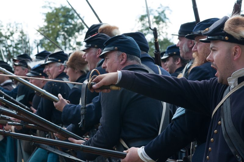
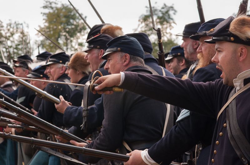
Here's a US Civil War photo. As you can see, the people are decently exposed, but the sky is blown out. The image is also somewhat flat. It's also not one of my best - it's a little lacking. What can we do? How can I pimp this?

Well, first of all we need to set the white balance correctly so that we have a better notion of what we're dealing with. Auto exposure has rendered this shot a little too harsh and chill, so let's tweak it. The Daylight option is accurate, but I want a warmer feel, so I'm choosing Cloudy - despite the day being quite sunny. For an accurate colour cast you can also select the dropper tool and click on a neutral white or grey colour. I opt to warm it a little further by sliding the temp slider just a few kelvin to the right.

Now let's retrieve those highlights. The best way is not by decreasing exposure but by pulling back on the hightlights - to the left. However, we don't want to diminish the highlights in the bulk of the image, such as the mild glint of the sword. So, let's work with the ND Grad. We click and drag it from the top. By opting for a drastic change, such as darkening by three stops, you can see which area it covers. Now, let's pull the highlights back until we get a hit of blue in that sky. You can see from the histogram above the tool bar the detail you recover. You'll see the burnt out peak of white clipping the right edge, pull back the highlights and you'll get a sharp peak free of the border.

The overexposure has damaged the transition from dark to light however, rendering the trees ugly. Let's knock down the clarity. Out with the brush, select clarity to -40 and then take off another twenty to compensate for a later adjustment we'll be making, hit 'o' to see what we're painting and get to work. Make sure Auto-Mask is selected, so it knows not to run over the hats and the bayonets. You'll have to do some tidying with the erase and repaint with a smaller brush, natch.

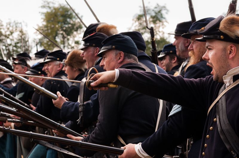
Ahh... that's better:

Image

Now we want to add a bit of clarity to the overall image. If we add +20 we get a nice, not-too-showy but rather grittier effect on the soldiers. Clarity basically adjusts local contrast - upping the grit and the sharpness of the lines without messing the exposure too much. It is the most delicate of tools to my mind, as decreasing too far makes a horrible airbrushed image, while too far (unless in B&W) gives it a fake Zack Snyder HDR look. So plus 20 it is.

Now let's get to work with our exposures. Let's darken the blacks a touch, make it moodier. You can see as we pull back on them the left hand side of the histogram drifts to the left border. If you hit 'J', areas of blue (for pure black) and areas of red (for pure white) will show zones of lost detail. You can get away with loss of shadow detail, but burnt our whites are a problem.

Let's pull the shadows back as well by a few points, and now up the whites by a few. Finally, for a little more punch we add +15 or so to contrast. You may have to dial Highlights back as you do this, or lessen the darks, as contrast will push the exposures either way.

Looking good. Now we want to add a little oomph to the sword. By clicking on the Tone Curve button and then on the dark flat of the sword and pulling down, we increase the shadow a smidgeon, making the light side stand out better. This will handily effect similar metal in the photo.

It's time to start picking out the details that make this shot. We turn once again to clarity. First, make out what the eye is drawn to and accentuate it. The eye first lands on the sword, follows it past the hilt and along the arm to the officer on the extreme right shouting. Let's add with the brush some clarity to him. We paint his body with +15, and then add a culmative +15 to his face. We then work on the rifles of the two nearest men, and their faces, with +10. (One thing, culmative brushes of +10, +10, etc have less effect than a simple +20, which makes for more subtle boosting.)

We then give the buttons a little +10 polish, for extra points the eye can land on while drifting around the photo.

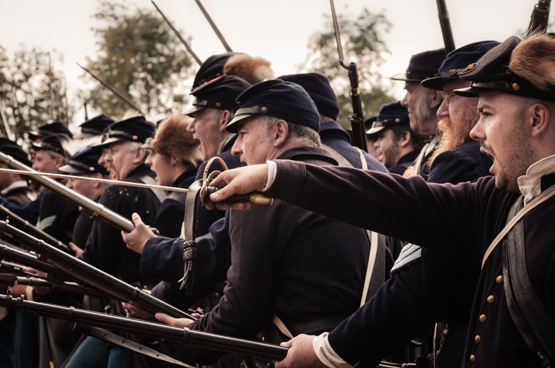
Ah ha - all nice and punchy now:

Image

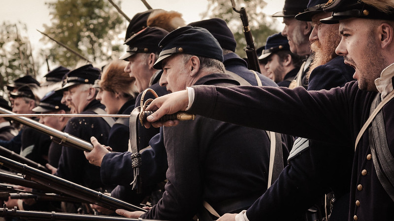
Time to think about colour. I like to desaturate Private Ryan style, so I pull saturation down by about -35. It's personal preference really. It pales the faces a little, making them look scareder, more haggard!

We then add a colour wash. Highlights and shadows I set to yellow, and add a few percent. If the trees were bare I'd go for a more wintery blue, but I want an evening light here. I then up the Orange channel saturation by + 35 to add colour to the hilt and the hats, but move the skin tone (red) by about -50 to really pale 'em. If you up vibrance you'll increase saturation on the bright, rich colours but avoid skin adjustments, whilst saturation effects everything. Therefore upping vibrance and lessening saturation can have a good effect. Or vice versa!

Finally we tweak a little until we're satisfied before doing our final two adjustments. A subtle vignette focuses attention on the sword. Then, we sharpen. Leave this until last, it saves processing power and has a cleaner look.

There's four settings to sharpen. Amount is self explanatory, I don't recommend above +60 and I rarely go above +35. Radius increases the contrast and punch of the main edges, such as of heads, arms, architecture. It's good for splitting up a crowd of jostling limbs, but not so great for complex delicate images. Detail adds edge to the individual hairs and fibres and such - great for animals and landscapes. Masking as it is increased mountingly forbids the addition of sharpness to out of focus areas, until at 100 every remains unsharpened.

With the crowd in the background I hit Radius to + 1.7, amount to +35, detail to +35 and masking to 79 to account for me wanting to keep the rest of people further back out of focus.

Much better:

Image

Finally, you know what, fuck it? I want to fix two things. I hate the jagged edge on the sword. This can be a problem with high contrast objects having chromatic aberations removed. Also, I want to make it more dynamic. Let's get in way closer. Let's tilt things to add the momentum of a charge. Let's really make that sword pointing at some fucking cornfed's heart.

Load the 16:9 shot! CHARGE!

Image

And that's how I Lightroom. :)

Big image version here: http://www.flickr.com/photos/nervouspet ... /lightbox/

_________________
"Peter you've lost the NEWS!"

Bored? Why not look at some pretty pictures on my photography blog? Here: http://petetakespictures.com

Come & See My Flickery Pics Here: http://www.flickr.com/photos/nervouspete/


Top
 Profile  
 
 Post subject: Re: Photo Editing Lightroom Fun
PostPosted: Fri Jan 11, 2013 21:36 
User avatar

Joined: 12th Apr, 2008
Posts: 17771
Location: Oxford
Ace!

(-5 points for no pictures of young Pvt Kern. Although he'd probably gone AWOL again)


Top
 Profile  
 
 Post subject: Re: Photo Editing Lightroom Fun
PostPosted: Sat Jan 12, 2013 12:21 
User avatar

Joined: 30th Mar, 2008
Posts: 16559
Excellent, the final slight change of angle works really well, looks so much more like a charge.


Top
 Profile  
 
Display posts from previous:  Sort by  
Reply to topic  [ 13 posts ] 

All times are UTC [ DST ]


Who is online

Users browsing this forum: No registered users and 0 guests


You cannot post new topics in this forum
You cannot reply to topics in this forum
You cannot edit your posts in this forum
You cannot delete your posts in this forum
You cannot post attachments in this forum

Search within this thread:
You are using the 'Ted' forum. Bill doesn't really exist any more. Bogus!
Want to help out with the hosting / advertising costs? That's very nice of you.
Are you on a mobile phone? Try http://beex.co.uk/m/
RIP, Owen. RIP, MrC.

Powered by a very Grim... version of phpBB © 2000, 2002, 2005, 2007 phpBB Group.